

Where geometry is powerless. Why the "fair" map of the world has sparked new disputes at the UN
Where geometry is powerless. Why the "fair" world map sparked new debates at the UN
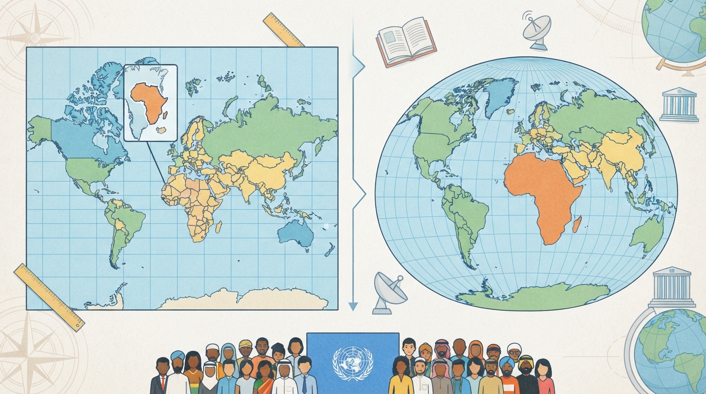
On September 4, the UN General Assembly supported the Correct the Map resolution: 164 states voted in favor of a wider application of maps that preserve the real proportions of the areas of continents. Only the United States voted against. But behind this high-profile decision lies a more complex picture: the UN did not ban the familiar map, the Mercator projection was never the only official standard, and the dispute over the size of Africa almost immediately shifted to a discussion of Crimea, Kosovo, Kashmir, and the islands that Japan calls the "Northern Territories." Let's look into why the "distorted" map became so popular, what other options humanity had, and why they decided to change something right now.
## Is there a "correct" UN map?
The news of the UN decision is easy to mistake for the replacement of one map with another. In fact, the resolution does not ban the Mercator map and does not declare Equal Earth to be the only acceptable one. It merely recommends that states, schools, international organizations, the media, and technology companies use the latter version and other projections where it is important to compare the sizes of territories, as well as to explain the limitations of any flat map.
This is also important because, prior to the current vote, the UN Secretariat did not have a single prescribed projection for all maps. The Organization's Geospatial Section explicitly points out: the UN has used different solutions for world maps, and for regional and national maps, the projection was selected for a specific territory and task.
Even the map on the UN emblem is not a Mercator projection. Therefore, it is more accurate to speak not of the UN "changing its map," but of an attempt to change the international norm: it is precisely about area, about making the map show it without systematically enlarging high latitudes.
## Why the world needed "Mercator"
The story begins in 1569. Flemish cartographer Gerardus Mercator did not create his projection as a school depiction of the planet or as a political statement. Its main advantage was practical: it preserved local angles, and a line of constant compass bearing became a straight line on the map. For a 16th-century sailor, this was a huge convenience: a course could be plotted with a ruler.
But this convenience came at a geometric cost. A spherical surface cannot be unfolded onto a rectangular sheet without distortion. If the Mercator projection preserves angles and directions, it must stretch the surface increasingly as it approaches the poles. This means the problem is not a cartographer's error, but the properties of the chosen mathematical model.
This is precisely why Greenland looks almost comparable to Africa on the familiar map. In reality, Africa is about 14 times larger. The French Ministry of Foreign Affairs, explaining its rejection of "Mercator" in diplomatic materials, also noted a broader effect: the US, Russia, and China receive a disproportionately large visual weight on such a map compared to Africa, South America, and Southeast Asia.
According to World Factbook reference materials, the area of Africa is about 30.1 million square kilometers, Russia is about 17.1 million, the US is about 9.8 million, and India is about 3.3 million. That is, Africa is roughly comparable in area to Russia, the US, and India combined. This is not visible on "Mercator."
Was Africa shrunk intentionally? There is no reason to believe that Mercator in 1569 specially created the projection for the sake of politically shrinking the continent. His task was navigational. The political dispute arose much later—around the fact that a tool with an obvious distortion of areas outlived its original function and became the familiar picture of the world for millions of people.
## How the sailors' map got into smartphones
The long life of "Mercator" is explained not only by colonial heritage. The rectangular grid was convenient for printing, atlases, and navigation, and in the digital age, it gained a new technical advantage. Web maps divide the world into square tiles—fragments that are easy to load and zoom in on by scale levels.
At scale zero, the world fits into a square of 256 by 256 pixels; the image is cut off at approximately the 85th parallel to maintain the square shape and simplify tile selection. Thus, the 16th-century projection received a second life not on the deck of a ship, but in software architecture.
Hence the answer to the question of why it was used for so long. First, "Mercator" was extremely useful to sailors, then it became a familiar publishing format, and later it proved convenient for digital platforms. Its prevalence did not prove that it was the best at conveying the sizes of continents. It only showed that different eras repeatedly found a function in it that was convenient for them.
## Alternatives existed before
Mercator has plenty of competitors. Some projections preserve area, others preserve angles, and still others try to distribute errors so that the entire map looks visually more natural. Long before the current resolution, the UN used Robinson, Winkel Tripel, and Eckert IV for world maps—precisely because they balance distortions of area, direction, and distance in different ways.
Equal-area projections did not appear in 2026 either. Mollweide and other equal-area solutions have long been used in thematic cartography when areas need to be compared fairly. Gall-Peters became known as an attempt to make the sizes of the countries of the Global South visually proportional, but its elongated shapes triggered their own wave of criticism. In other words, for decades, the problem of a "fair map" rested not only on mathematics, but also on the fact that people need to recognize the outlines of a familiar world.
Equal Earth appeared in 2018 as an attempt to combine two requirements. Bojan Šavrič, Tom Patterson, and Bernhard Jenny created an equal-area pseudocylindrical projection that preserves area relationships but resembles the more familiar Robinson in its overall silhouette. The authors explicitly called it a visually appealing alternative to Gall-Peters.
However, Equal Earth is not perfect either. Equal areas are achieved at the cost of changes in shape, distance, and direction. And this is one of the key points of the UN resolution itself: it is impossible to project a sphere onto a plane perfectly, so a map must be chosen depending on what exactly it is meant to show.
## Why the issue arose right now
At the 39th session of the Assembly of the African Union in February 2026, the continent's leaders supported the Correct the Map initiative, promoted by Togo. In June, the African Union was already describing it as part of a broader task of "globally repositioning" Africa.
After that, Togo brought the topic to the level of the General Assembly on behalf of the African Group. Before the vote, Foreign Minister Robert Dussey thanked the delegations for consultations and compromises. The UN Secretariat reported that Azerbaijan, Belarus, Brazil, France, Indonesia, Malaysia, the UAE, and other states had additionally joined the draft as co-sponsors.
Broad support was also facilitated by the cautious design of the document itself. It is recommendatory in nature, does not cancel navigational maps, does not require textbooks to be immediately reprinted, and recognizes that different projections are suitable for different purposes. Canada, Australia, and New Zealand separately noted these caveats after the vote as important for their "yes."
The symbolic momentum was reinforced by France. On the day of the vote, French Foreign Minister Jean-Noël Barrot announced that the ministry would abandon Mercator for diplomatic use in favor of projections better suited to the task and more accurately conveying areas. For a campaign that grew out of the African Union, the support of a major European diplomacy was a particularly notable gesture.
Finally, the movement had a ready-made modern alternative that is easy to distribute. Equal Earth maps are available in high resolution and are in the public domain. In a digital environment where comparing the outlines of continents becomes a viral image in minutes, a dispute that previously remained within cartography turned out to be understandable to a wide audience.
## Why the US voted against
The American delegation did not dispute that "Mercator" enlarges high latitudes. Its objection concerned the political framing of the initiative. The country's representative criticized the fact that the cartographic theme in the text and speeches of supporters was linked to reparations.
For Washington, the issue looked not like a neutral recommendation to cartographers, but as another element of the agenda of historical responsibility and decolonization within the UN. The American representative stated that the Organization should deal with issues of peace, prosperity, and international relations, rather than turning a discussion about a 16th-century projection into a tool for a broader ideological agenda.
In its official explanation of the vote, the US criticized the meaning and priority of the resolution, rather than refuting cartographic geometry. The dispute was over whether a technical problem should be framed as a matter of historical justice at the General Assembly level.
## Where borders begin
After the vote, another problem emerged that is easy to overlook. A projection only answers the question of how to transfer coordinates from a sphere to a plane. It does not decide where to draw a state border, what color to paint a disputed territory, and whose name to put on an island. This is already the editorial and political work of the authors of a specific map.
The Equal Earth website itself acknowledges this sensitivity. In the description of the political map's sources, it is indicated that Russian-controlled Crimea is shown in neutral gray, Western Sahara is designated as territory occupied by Morocco, and actual lines of control between China, India, and Pakistan are drawn in Kashmir. The map's creator separately warns: geopolitical issues are contentious, and users can modify the open sources.
For Ukraine, this very layer was the reason to abstain. Kyiv stated that it does not object to a scientifically correct display of relative sizes, but considers political maps associated with Equal Earth unacceptable when they affect the internationally recognized borders of Ukraine. During the meeting, a warning was voiced that an attempt to correct one injustice should not open a "Pandora's box" in matters of sovereignty.
The European Union, and then Canada, Australia, New Zealand, Norway, Iceland, and Liechtenstein, recorded a similar caveat: the resolution does not affect sovereignty, territorial integrity, state borders, and the legal status of disputed territories. In other words, the majority supported the geometry of areas, but did not grant the cartographic website a political mandate.
## Japan voted "yes" but then changed its mind
Among the 164 states that voted for the resolution was Japan. However, a few days later—on September 10—it demanded a change to the Equal Earth political map. The reason was four islands northeast of Hokkaido: on one version of the map, they were colored as Russian territory.
These are Iturup, Kunashir, Shikotan, and the Habomai group (a group of islands of the Lesser Kuril Ridge). They have been part of Russia following the results of World War II. However, Japan disputes their ownership and calls them its "Northern Territories."
On September 11, Tokyo reported that the display had been changed. According to The Straits Times, in the Japanese version of the map, the islands received the color of Japan, and in the English version, a neutral design with an explanation of Russian administration and the Japanese claim. This episode is particularly telling: a state can support Equal Earth as a mathematical projection and at the same time categorically disagree with the political layer of a specific map.
The story with the islands actually confirmed the caveats voiced in the General Assembly. "Correcting" the size of Africa can be done mathematically. "Correcting" Crimea, Kosovo, Kashmir, Western Sahara, or disputed islands with a single formula is impossible, because international law, diplomatic positions, and actual control are already at play here.
## What will change now
The resolution does not oblige an urgent abandonment of "Mercator." The General Assembly document is recommendatory in nature and separately preserves space for navigational tasks. Moreover, at the street level, Web Mercator remains technically convenient, and a huge infrastructure of digital tiles is built around it.
The most noticeable changes can logically be expected where the whole world is shown in a single frame: in school atlases, textbooks, journalistic infographics, international presentations, and materials on climate, population, and resources. If the purpose of a map is to compare how much space Africa occupies relative to Russia, Europe, or Greenland, an equal-area projection answers this question more accurately.
"Mercator" is still strong where directions and local angles are important. Equal Earth is strong where areas are important. Robinson and Winkel offer their compromises.
## The world has not grown larger—the view of it has changed
Cartographers have always known the price of "Mercator." What was new was the decision of the majority of states to bring this price out of the geography textbook into the political sphere and declare: a convenient tool of the 16th century should not automatically determine how a person of the 21st century imagines the size of the planet.
Africa has not grown. Russia has not shrunk. Greenland has remained the same. Only the recommendation on what mathematical price society is willing to pay for a familiar view of the map has changed. And it is paradoxical that almost immediately after the attempt to make the world map "fairer," the dispute shifted from the sizes of continents to borders—where geometry alone is no longer enough.